
Example report
Typical visualisations of a report are shown below:
Who are there - What relevant pathway genes are present in your samples?
This unsupervised heatmap showing that MIP sequencing distinguishes cervical (left cluster) and fecal microbiome (right cluster). In the cervix mainly cervix-related bacteria were detected (Gardnerella and Lactobacilli, in total 22 species). In feces in total 1255 sequences that could be annotated to 132 species were detected.

Data table
Datatable showing significant genes present in the samples (same data as in boxplot above, but now made searchable).

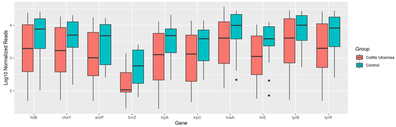
What do they do? - What relevant genes are expressed to significant levels?
The example shows box plots that display genes that show elevated levels of genetic activity to tyrosine pathway and SCFA production in the healthy controls samples compared to the diseased samples.
How are found genes in the sample groups connected?
This network contains all genes as nodes. Each edge between the nodes indicates the similarity between the genes. The coloring of the edges is based on whether the similarity exist in either group 1 Disease (green), group 2 Control (red), or both (blue).

The second network compares the difference between the similarities in group 1 and group 2 and visualizes the difference between these values. The edges are colored based on three scenarios: the absolute difference is larger than 0.8 (red), the absolute difference lies between 0.7 and 0.8 (yellow), and the difference is lower than 0.7 (blue).
